top of page


Aaron's Cool Summer Campaign
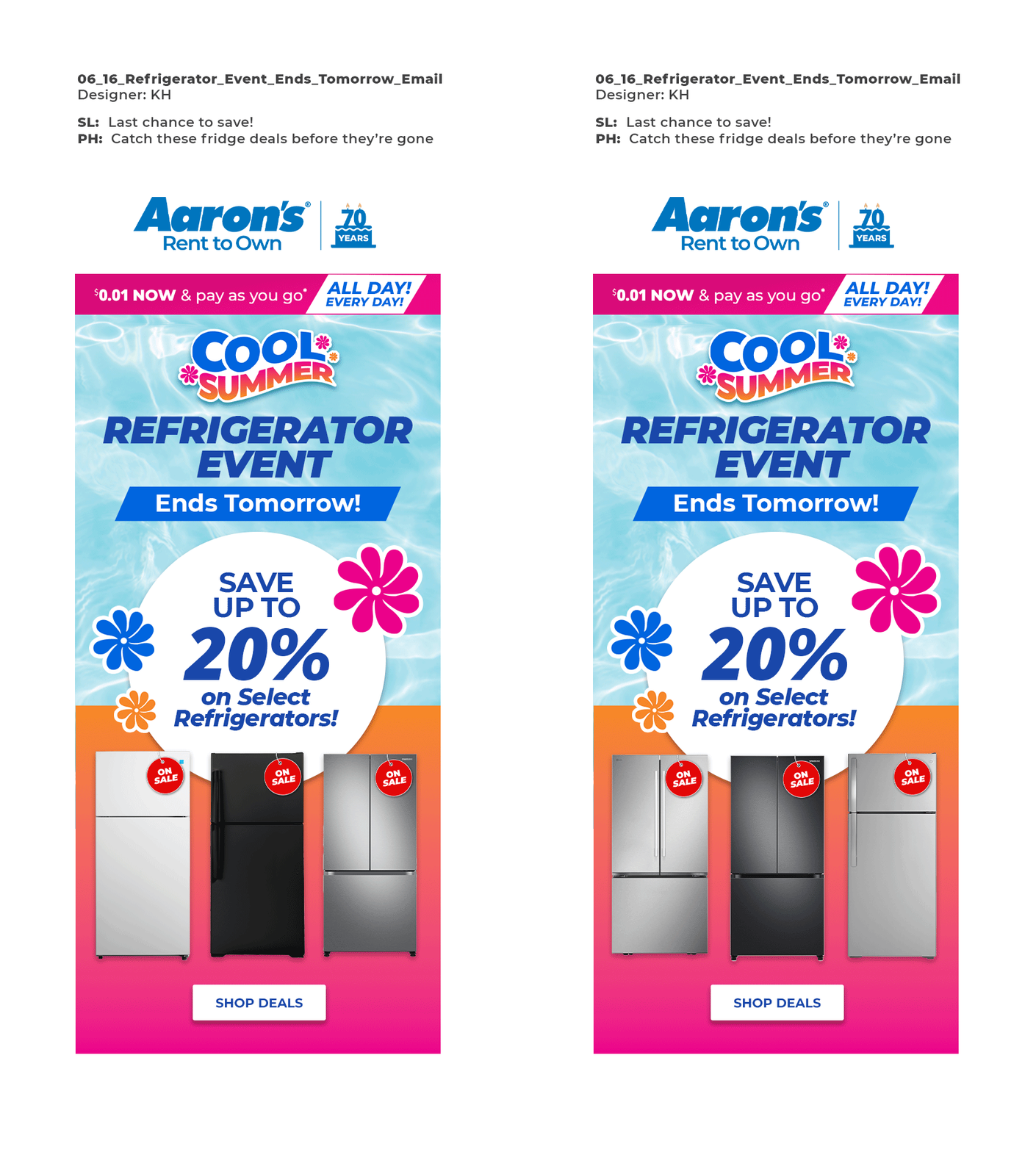
The Aaron’s “Cool Summer” campaign was a month-long initiative designed to drive seasonal sales. Tasked by stakeholders to deliver a fresh, eye-catching aesthetic that pushed creative boundaries while honoring the core brand, I led the overarching visual concept. I designed the campaign logo by manipulating the brand’s Montserrat font to mimic the fluid movement of an ocean wave, accompanied by a versatile suite of custom vector embellishments. This toolkit served as the foundation for our entire creative team, scaling seamlessly across print, web, email, and social media. Below are the specific digital assets I designed for the rollout.


Website, Email, and Social Assets


bottom of page